UX Case Study
HealthyFull
All-in-One Mobile App to achieve all your Nutrition and Wellness Goals and create sustaining healthy habits.
Get Started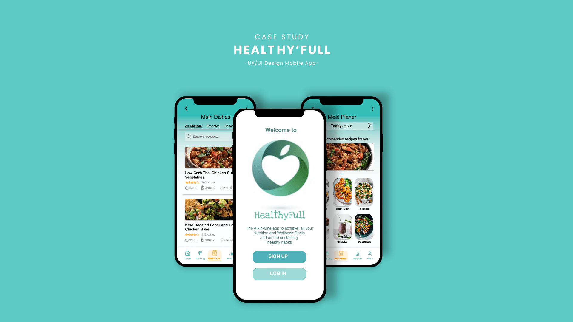
All-in-One Mobile App to achieve all your Nutrition and Wellness Goals and create sustaining healthy habits.
Get Started
People want to live a healthy life and nutrition plays an important role for achieving that. However, there are a lot of misconceptions, misinformation, and confustions about what “healthy” really is.
People often don’t know to what extend food and nutrition affect their health.
Others believe they know, yet wonder why their goals fail.
HealthyFull is an app that helps users be more knowledgeble about nutrition and wellness, and how food affects their health.
It allows them to easily monitor their caloric intake and dietary patterns to aid in weight and disease management. Also, it has the capacity to create behavior change, and more effective goalsetting.
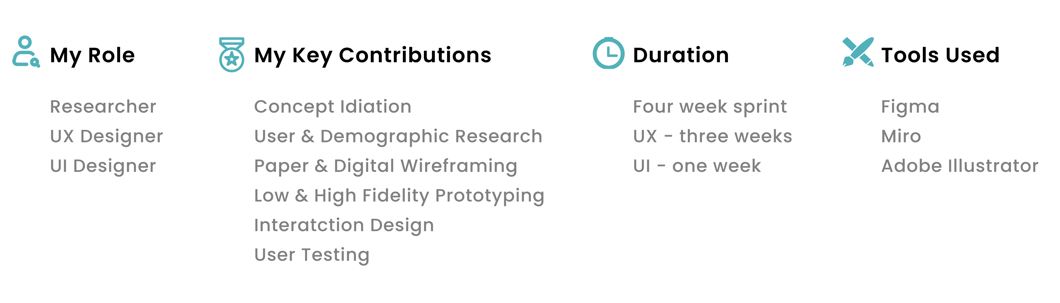
A great product experience starts with a good understanding of the users. In-depth questionnaires provide qualitative data about the target audience, such as their needs, wants, fears, motivations, and behavior.
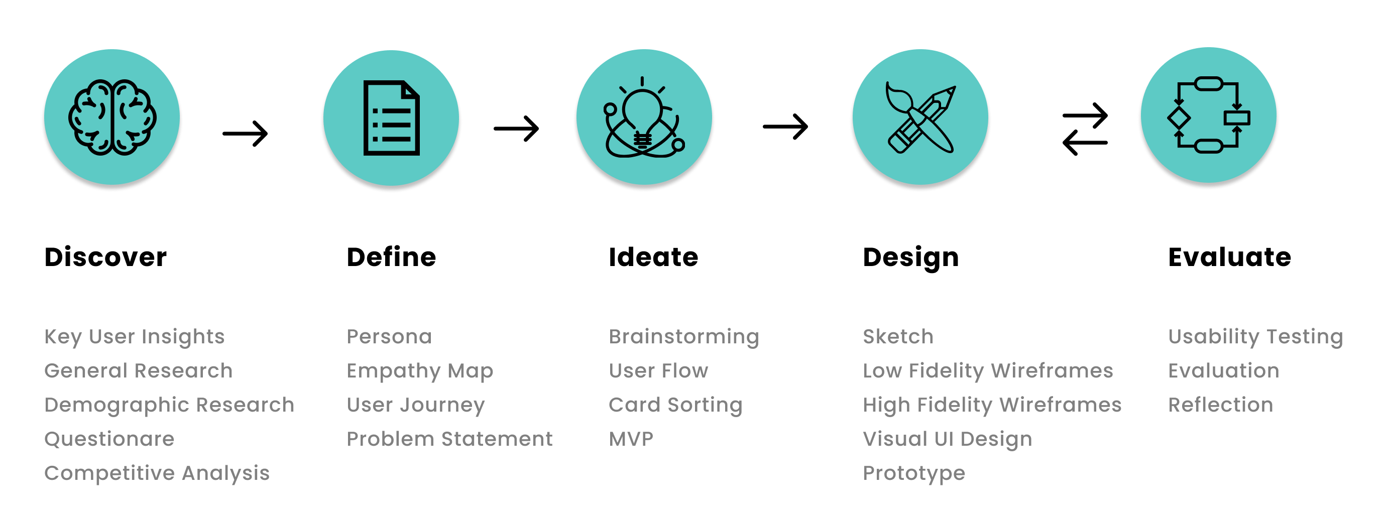
In this phase the following stages are explored:
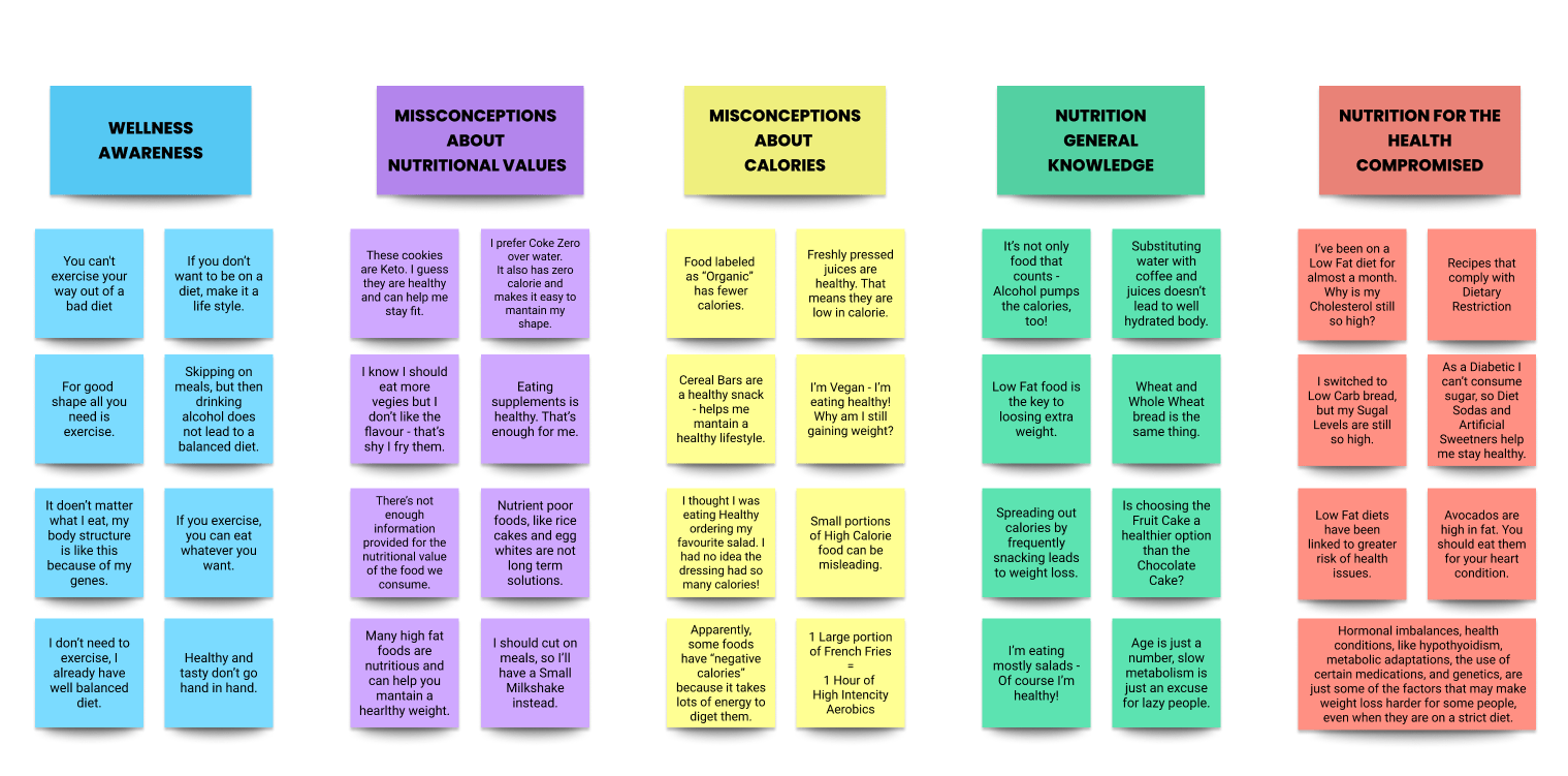
Frequently while listening to the everyday conversations of my peers, I've realized that there is a lot of misinformation and misconception about nutritional value of the food we consume - what we consider to be healthy, the daily intake of calories and caloric index of our meals.
People want to build healthy habits, and thereafter they expect reasonable results, but they get disappointed to realize why their plans are not working. Understanding the wellness, nutrition and our daily healthy habits seems to be more underestimated than we think.
This preliminary research provides a collection of statements, giving us a clear picture of the common and frequent misconceptions people face on daily basis.
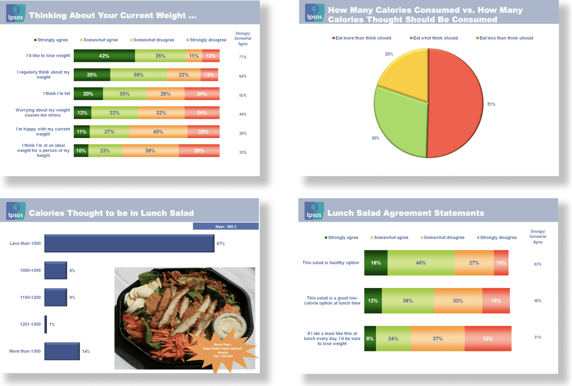
As the previously gathered general info needs to be backed by facts, I dived into science and stats to help me determine what part of the population is mostly concerned with the topic discussed. A research conducted by IPSOS (the 3rd largest market research company in the world) on "Calories Survey" and the CDC on "National Health and Nutrition Examination Survey" confirmed the existing issue of nutrional misinformation and that we're "starved of information".
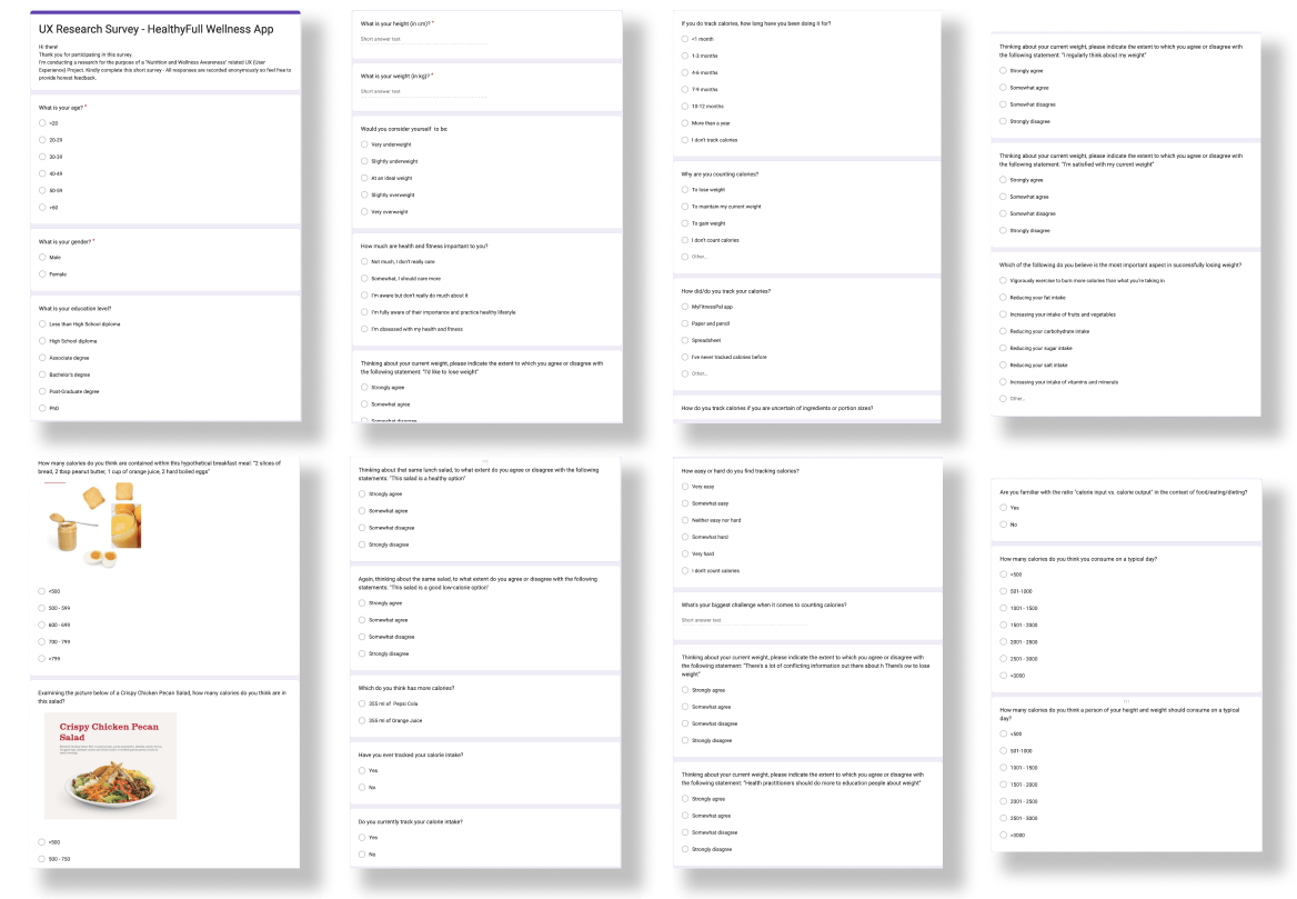
Through 30 surveys and interviews, I was able to narow down the scope pertaining the habits, perspectives and challenges the potential users are facing, and to gain more data about possible solutions.
I used some of the question from IPSOS survey, but also added few others which were more relevant for the local target audiance. The responses matched the data from the global servey, meaning I was on the right track.
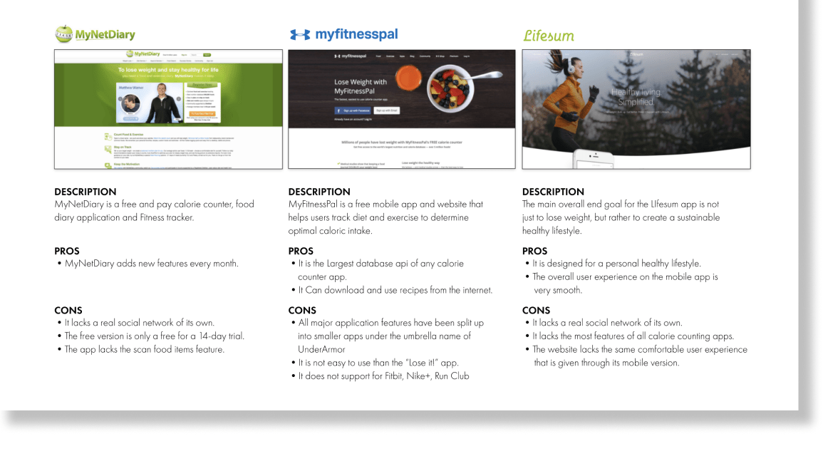
At the same time I have carried out the Competitive Analysis in order to know the strengths and weaknesses of the competition, to look for improvements and how to stand out and differentiate myself from them.
While their adventage include larger databases, downloadable recipes, and support from large corporations (My Fitness Pal is under the umbrella name of UnderArmor), most of them are paying apps, not supporting wearable deviced, missing barcode scaner, and lacking social network of its own. So these are the missing puzzles on the market that HealthyFull can tackle.
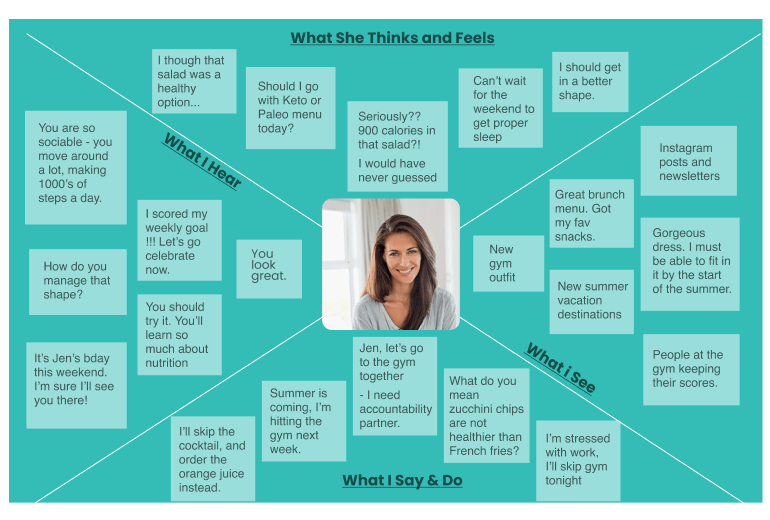
In this phase in order to get more close to the user’s way of thinking and feeling, I've created the Persona, and depicted her indepth thoughts and feelings.
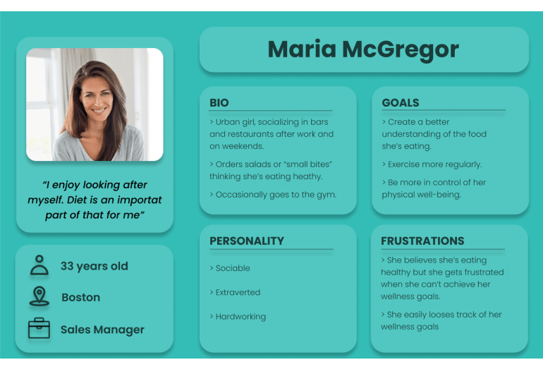
Maria portrays an urban girl with a busy working schedule, aspiring to find balance in maintaining a healthy lifestyle. She believes she is well informed about her eating habits, but we discover her Pain Point throught the Empathy Map, as she realizes her misunderstandings and confusion.
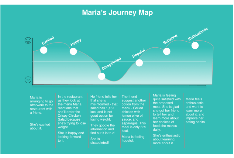
Developing a User Journey Map was particularly crucial for identifying the pain points Maria might feel — and the emotional “roadblocks” or “barriers” that she might face — in the process of achieving her fitness goals.
In this fictional scenario, believing she makes healthy choices that helps her lose weight and stay fit, Maria orders a Chrispy Chicken Salad, only to find out that the salad contains 1,150 calories - a whooping 89% of her suggested Daily Calorie Intake in just one meal!
Her frustration motivates her to look for convenient solutions.
Those last elements were crutial in helping me define the Problem Statement:
"How might we build a convenient app that helps users achieve a state of nutritional balance in life and helps them uplift their motivations by monitoring and managing their nutritional value and calorie intake over time"
With the problem defined, I have started to focus on the solutions and functionalities that my Minimum Viable Product (MVP) should contain.
The solution is creating an app which helps users to stay on track with their nutrient intake, provides nutritional information, offers meal planning from an integrated recipe book, which also motivates the user.
According to the needs of the previously conducted research, the solution should provide the followig features:
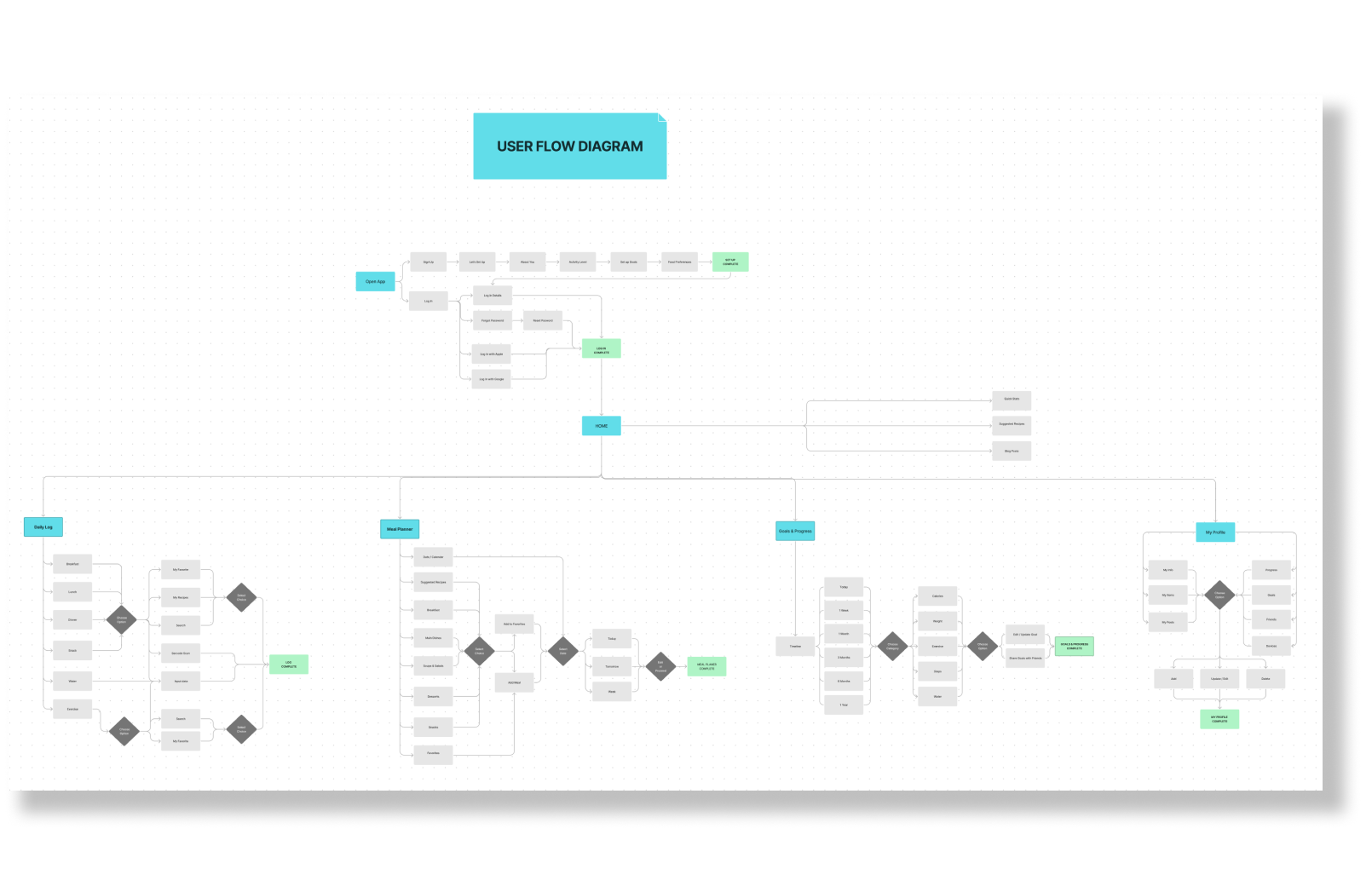
Information Architecture and User Flow are crucial aspects of UX design. Without proper sorting, most users would be lost and confused when navigating through the app.
Working on a visual solutions of the app was about integrating the User Interface elements, yet my main focus remained on the functionality rather than it’s appearance.
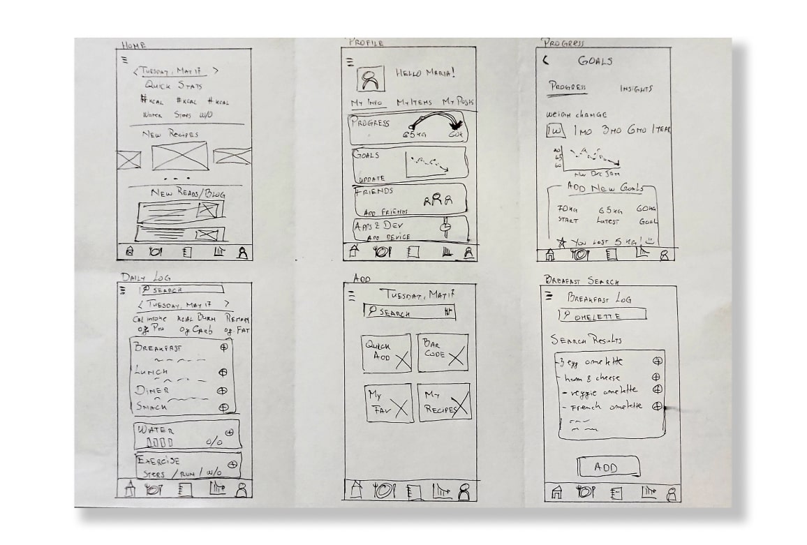
The simplicity of the Sketches and the Low-Fidelity wireframes allowed me to test ideas without diving into the details too quickly, but rather developing the user-cenrtric features.
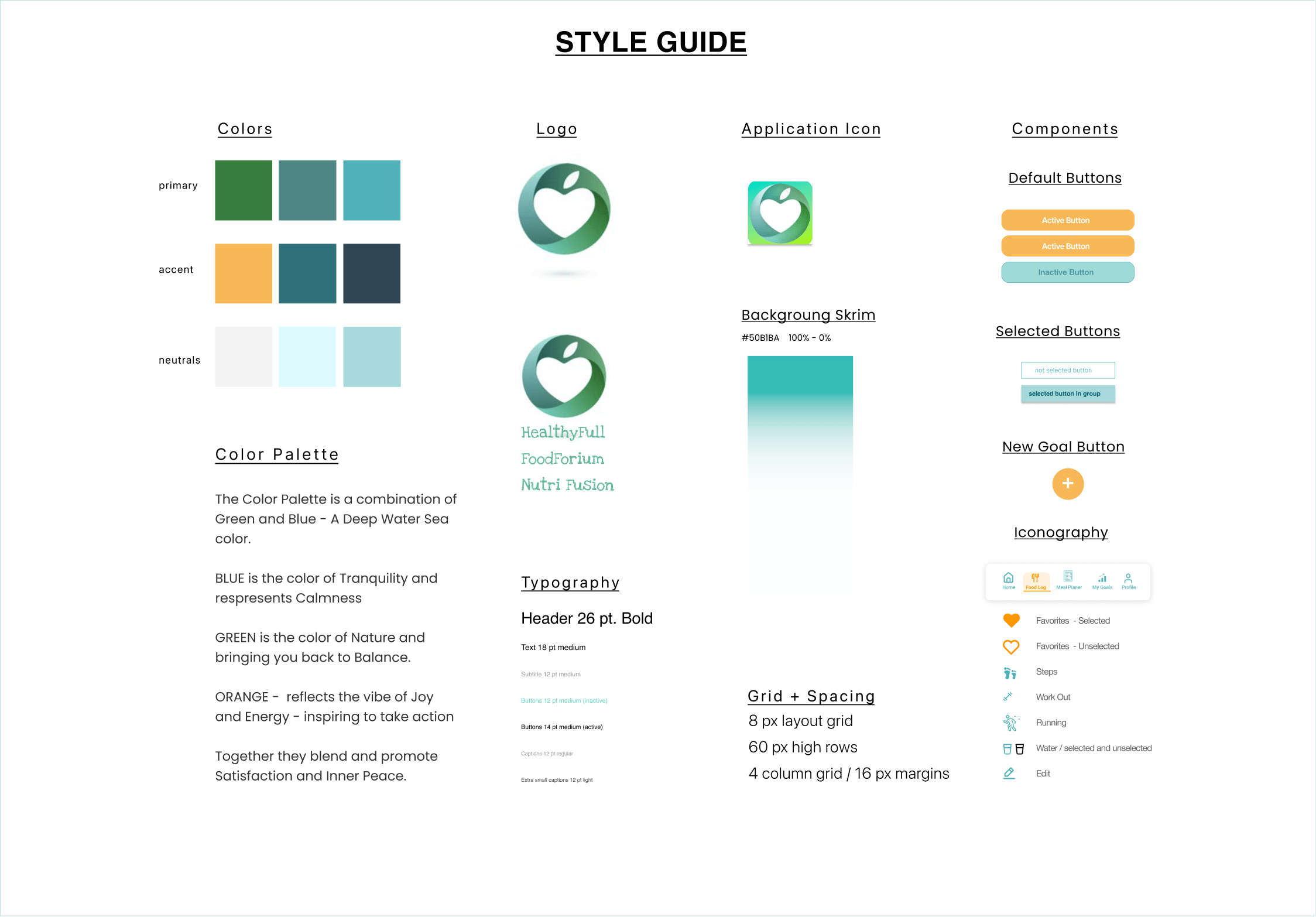
Finally, for the moment to "dress" the screens with carefully picked Style Guide, I opted for a color palette blending the colors Green and Blue - a Deep Water Sea shades.
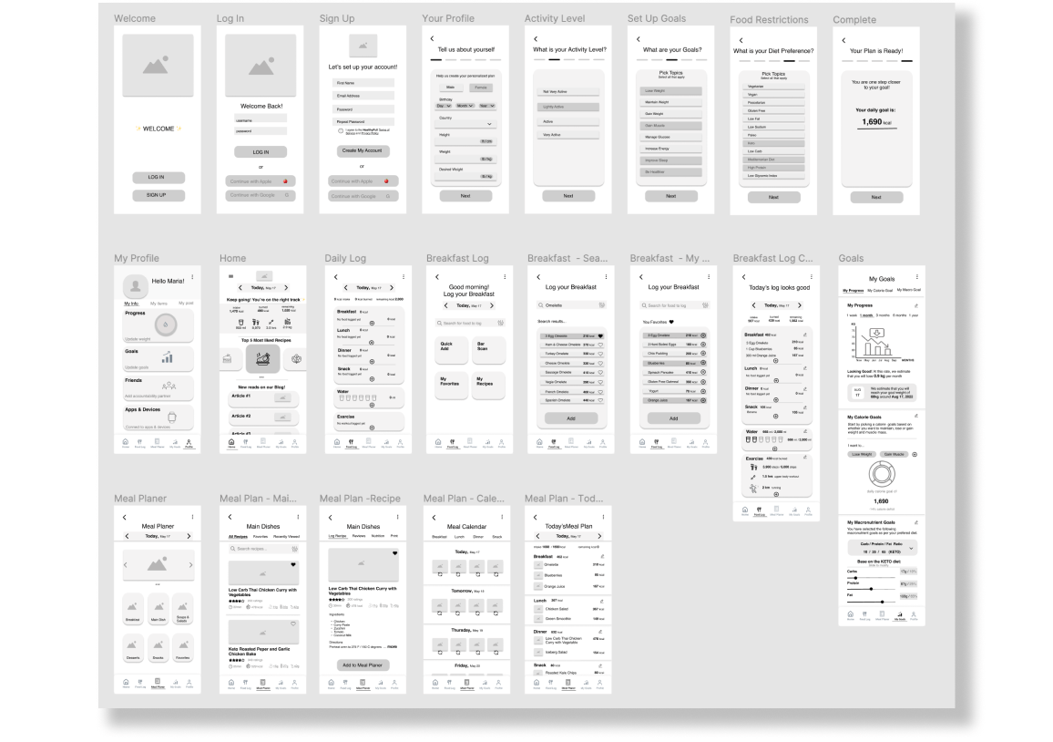
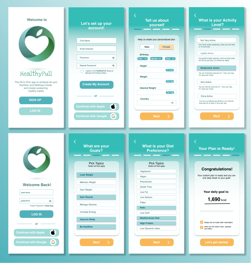
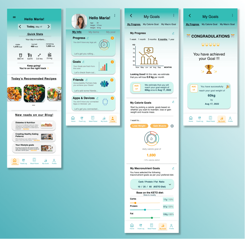
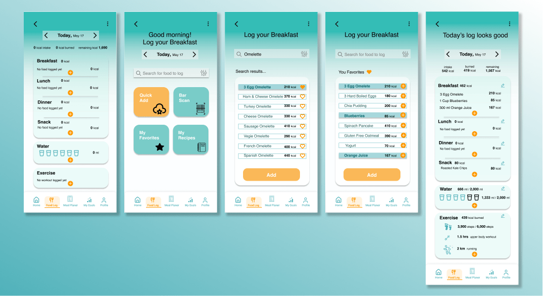
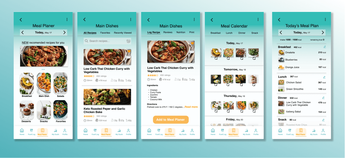
High Fidelity Wireframes illustrate the final version applying the UI concepts and all elements of the design solution.
It includes the following 4 sections:
The prototype was presented and shared with 23 friends.
In general, 90% were satisfied with the concept and design, and stated the app would be suitable and easy for them to use.
However, the following aspects were suggested to make the app more user friendly:
Takeaways and What I’d Do Differently
Working fully through this project taught me the importance of trying to think intentionally about every element of the project and how it can contribute to the end result.
For example, the final screen when the Goal is Acommplished, the user should not end the App use. Hence, offering the options for setting New Goals for continued app engagement.
Also, some of the screens are rather "text-heavy" and instead I should focus on less text and more intuitve icons.